Race Analysis at Your Fingertips
The ChartedSails mobile app puts your full race analysis right on your phone — on the dock, on the drive home, or sitting at the bar after racing. And it's free to install and free to import your files.
Here's a tour of everything inside, using a Melges 24 race day in San Francisco with three boats.
Your sessions, at a glance
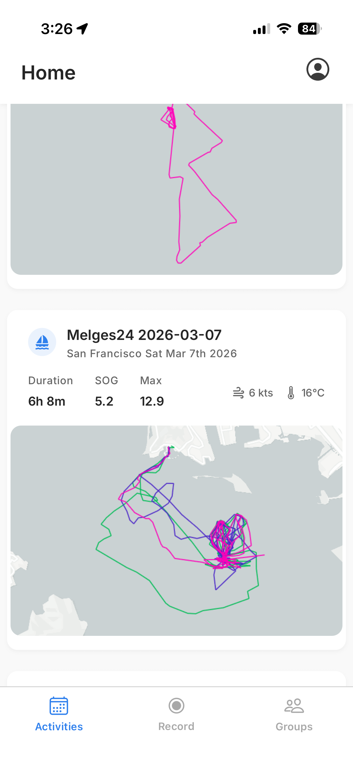
When you open the app, the Activities tab shows all your sessions. Each card gives you a quick preview of the tracks, the location, duration, average and max speed, and a snapshot of the conditions.
Tap on a session and you're in.
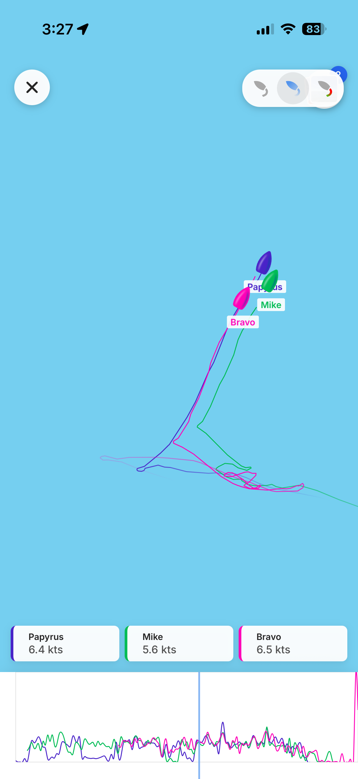
The map shows all the boats' tracks for the day, color-coded so you can tell them apart immediately. In the top-right corner, you'll notice a gallery icon — if you or anyone in the session uploaded photos or videos, they're right there, tied to the session.
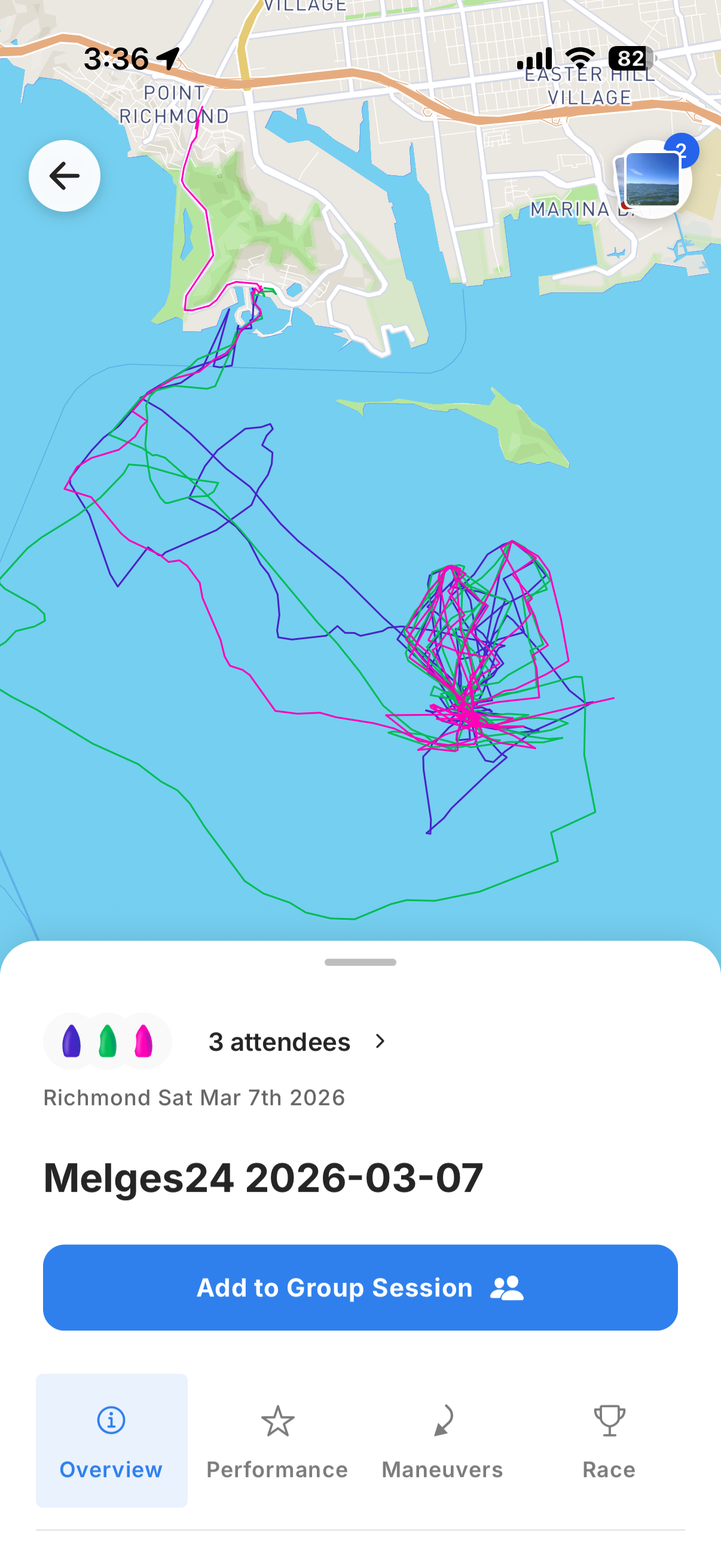
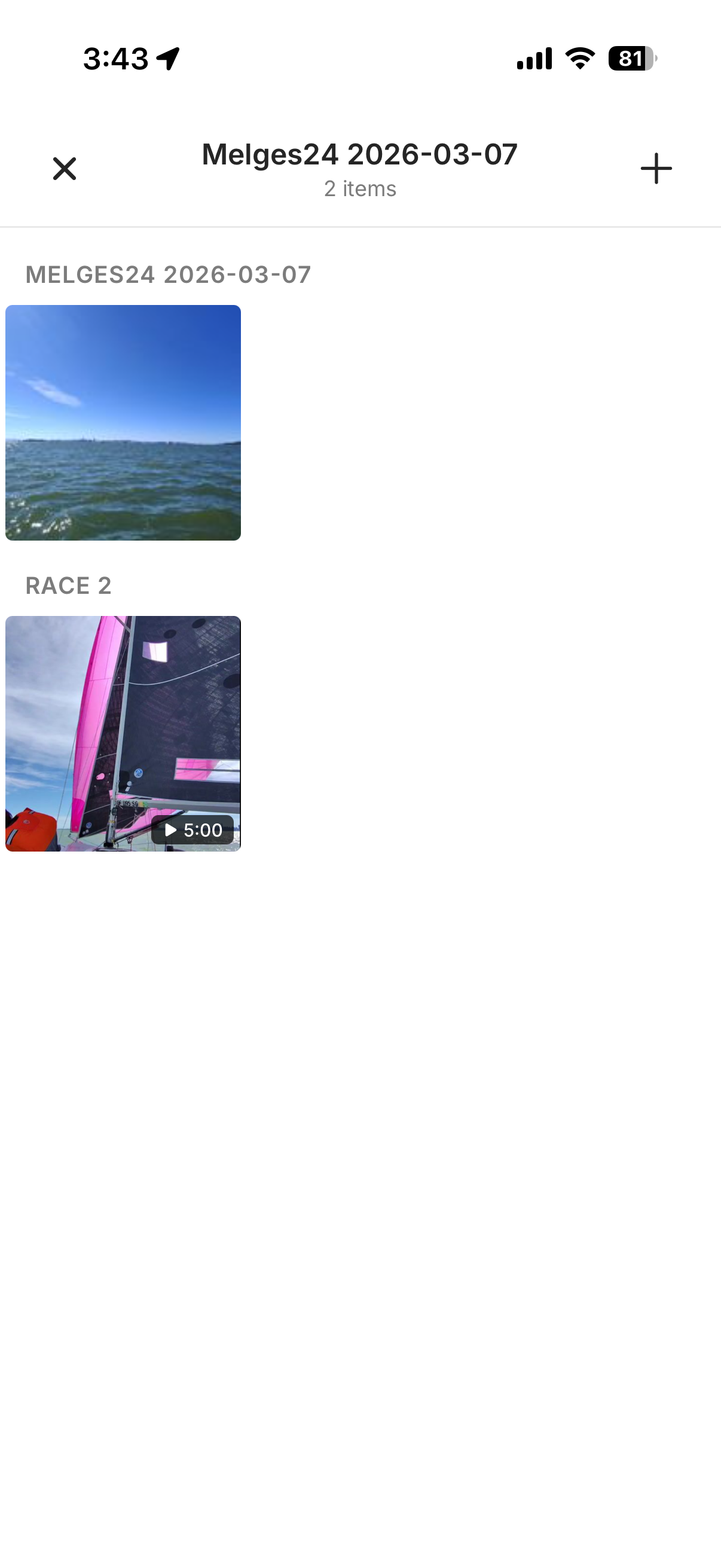
Anyone in the session can add their own photos and videos. Everything is organized by session and by race, so it all stays connected to the sailing data from that day.
Replay the race
Tap on the map and it switches to replay mode. The boats move along their tracks and you can see each boat's current speed in real time. Just like on the web, you can switch between tail modes: the last 10 minutes of track, the entire day's track, or a color-coded speed view where the track changes color based on how fast the boat is going.
Overview: the day at a glance
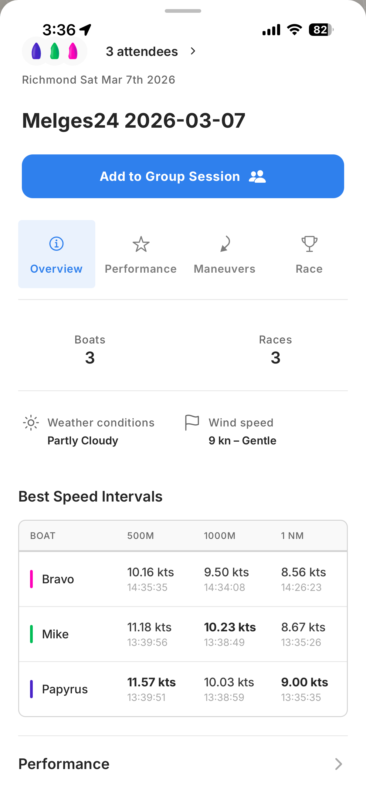
Scroll down from the map and the Overview tab gives you a quick summary of the session: how many boats and races were recorded, the weather conditions, and the best speed intervals — showing you when each boat hit their fastest 500m, 1,000m, and nautical mile, and how fast they were going.
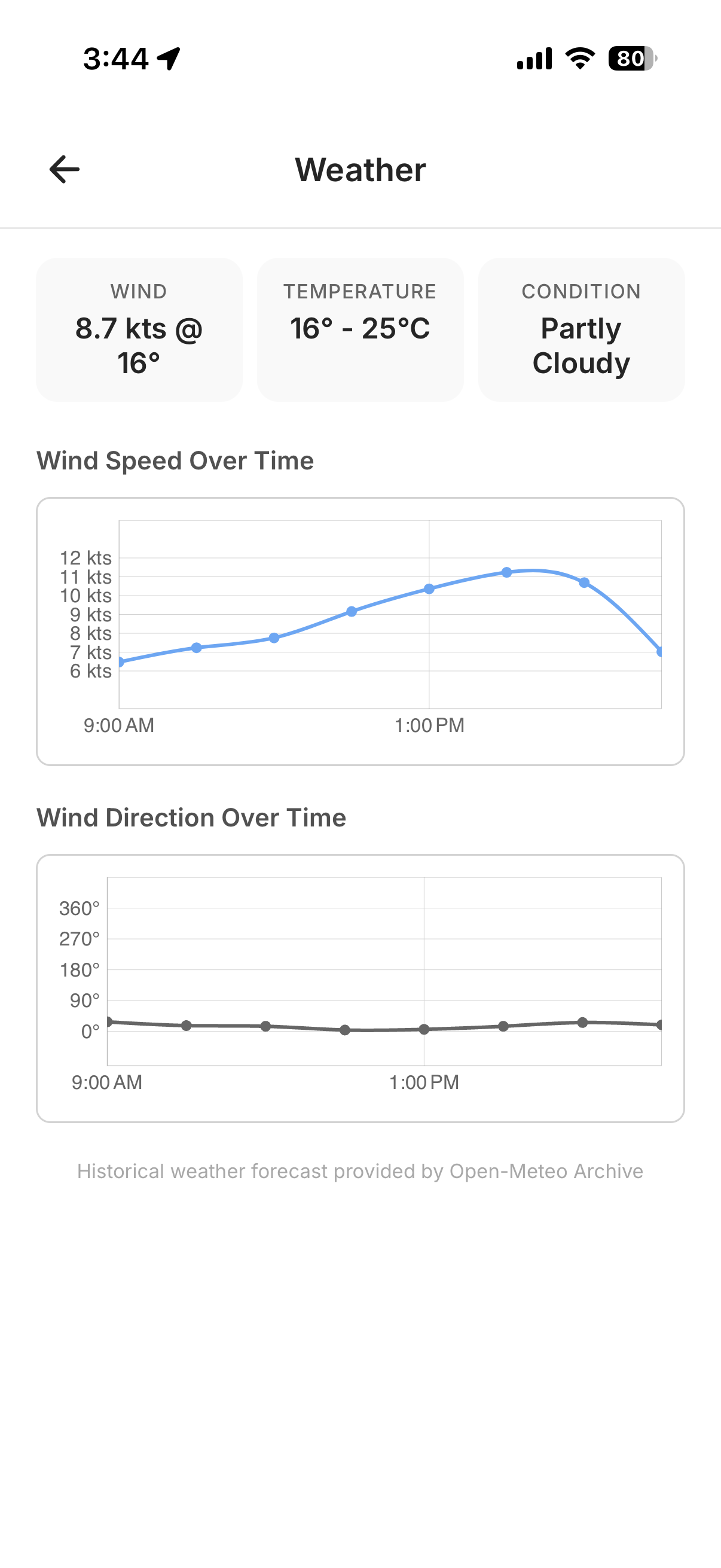
Tap on the weather summary and you get the full forecast for the day: wind speed and direction over time, temperature, and conditions. Handy for putting those speed numbers in context — was the fleet sailing in building breeze or dying pressure?
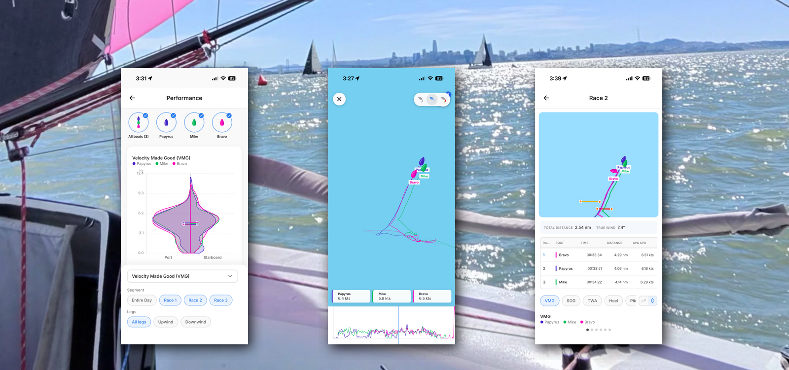
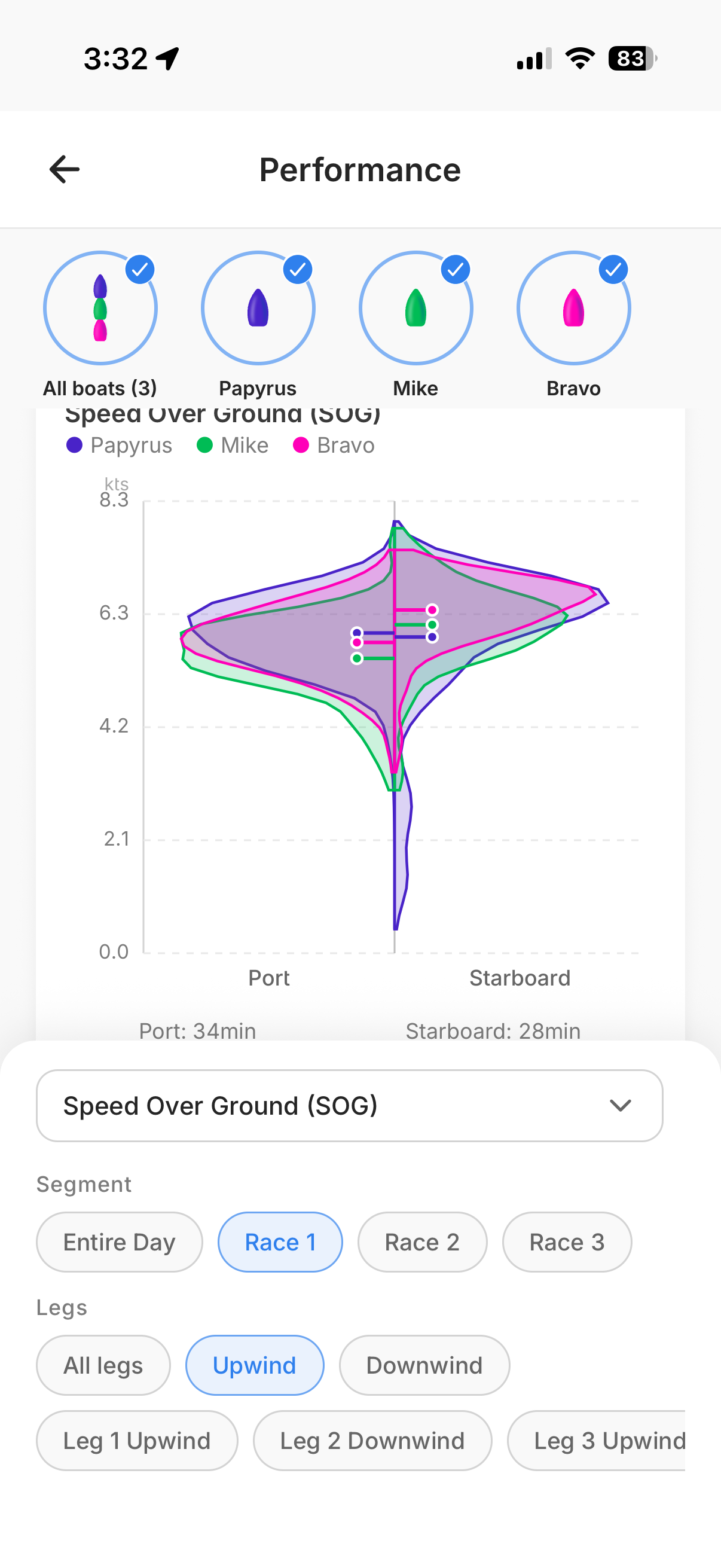
Performance: dig into the data
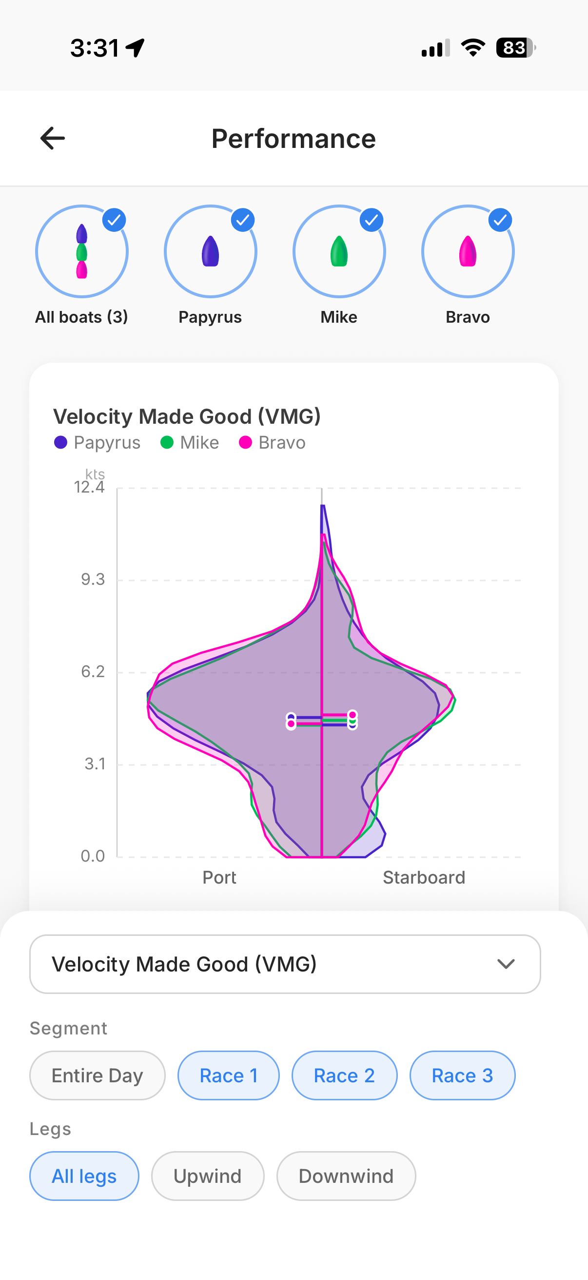
This is where it gets powerful. The Performance section shows a velocity distribution graph that splits the data between port and starboard tack. By default, it shows VMG for all races during the day — only the racing time, with the idle time stripped out, so the data is clean and useful.
You can slice it any way you want. Select which boats to compare — all three, or just one or two. Switch the variable from VMG to speed over ground, true wind angle, heel, or pitch. Filter by segment: entire day, or a specific race. And within a race, focus on just the upwind legs, just the downwind, or even a single leg.
Here we're looking at speed over ground for all three boats during Race 1 upwind. This kind of filtering is what makes the data actionable — instead of staring at a day's worth of numbers, you can ask specific questions like "Were we faster than Mike on starboard upwind in Race 2?" and get a clear answer.
Maneuvers: every tack and jibe
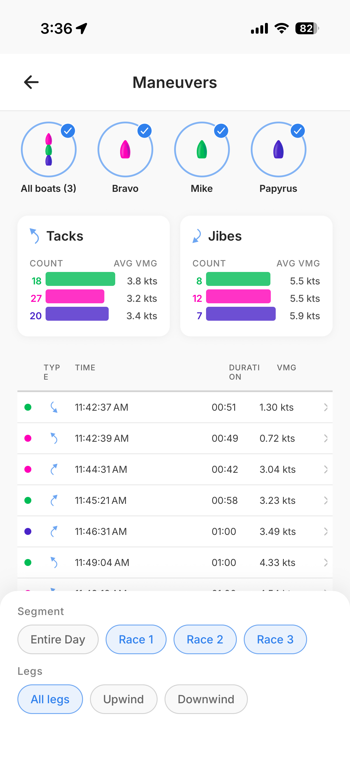
The Maneuvers section starts with a summary: how many tacks and jibes each boat performed during the day, and their average VMG during those maneuvers. VMG here is the speed made good on the race course, so you can see right away who's losing the least distance in their turns.
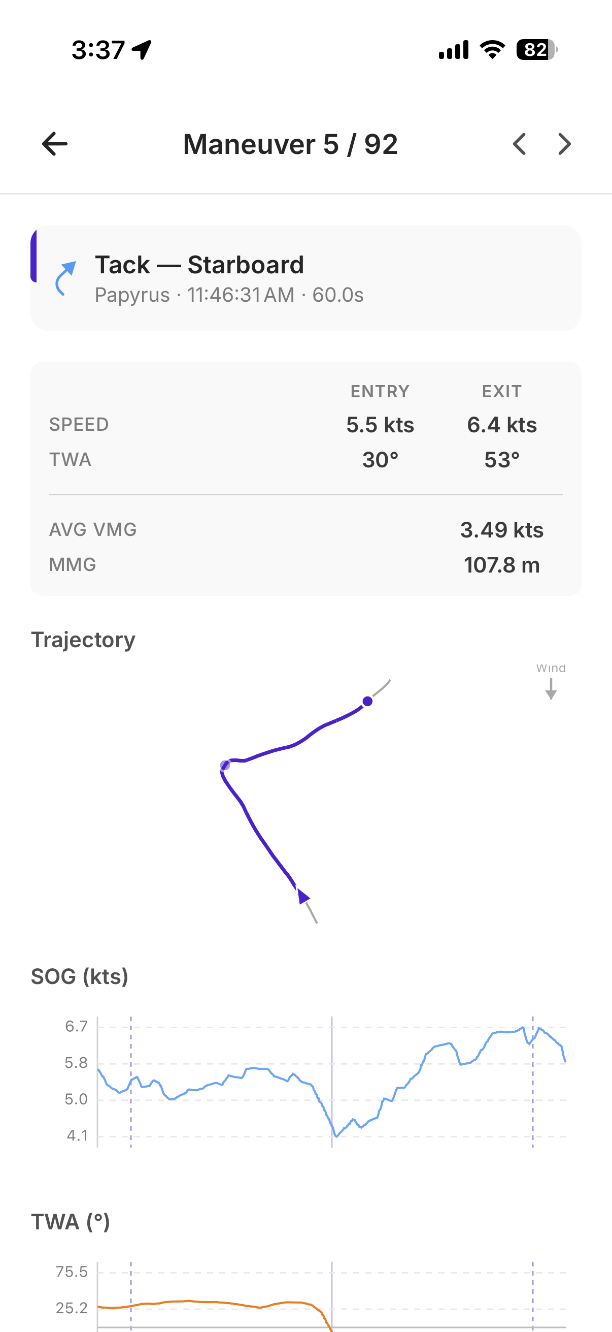
Tap on any individual maneuver and you get the full breakdown: the trajectory through the turn, entry and exit speed, entry and exit true wind angle, average VMG, and distance made good. Below that, time-series charts show your speed, TWA, rate of turn, heel, and pitch through the maneuver — everything you need to understand what happened and what to work on. Swipe left or right to quickly navigate through all the maneuvers matching your current filter.
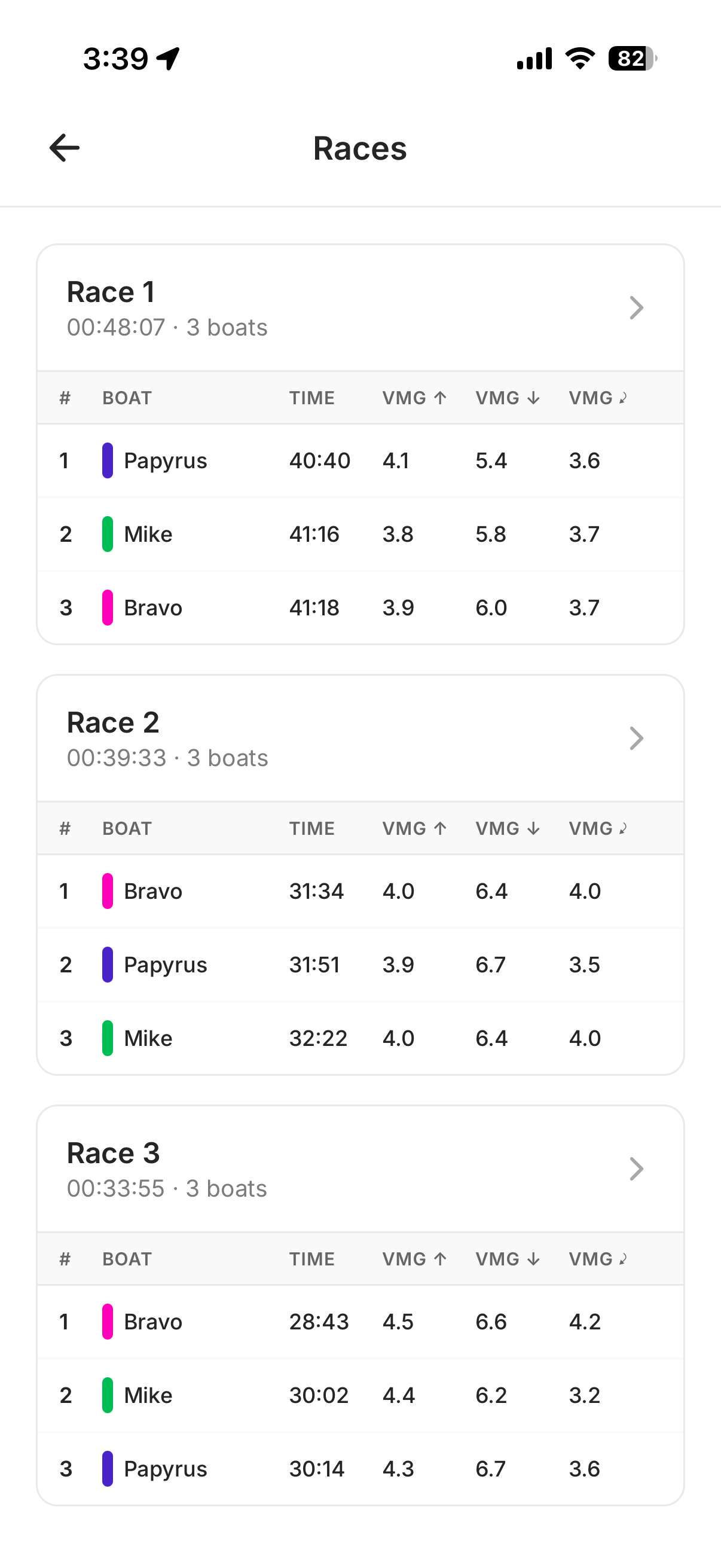
Races: compare boats across the day
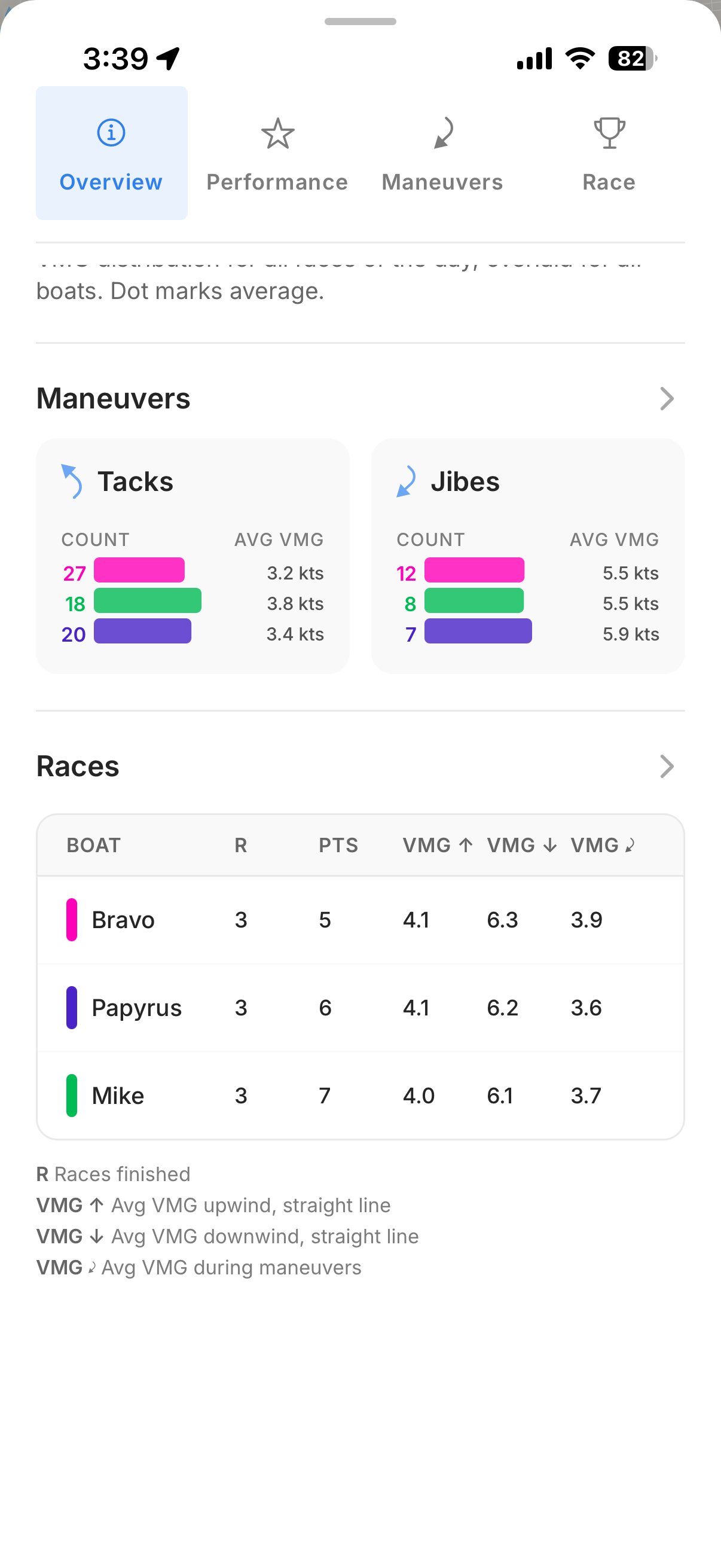
The Races section gives you a scoreboard for the day: total points, and the average VMG upwind, downwind, and during maneuvers for every boat. One table, and you can immediately see where each boat was strong and where they lost ground.
Tap in and the data breaks down by race. You can see each race's duration, the finishing order, and the VMG numbers per boat per race.
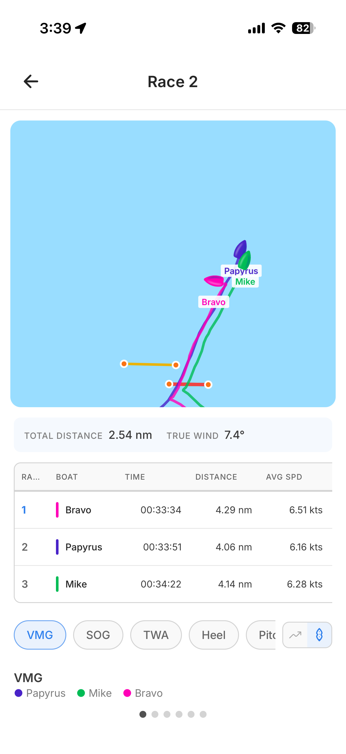
Go into a specific race and you get an animated view of the boats on the course, plus detailed stats: distance sailed, average speed, and time. Switch between data tabs — VMG, SOG, TWA, heel, pitch — to see the performance distribution for that race.
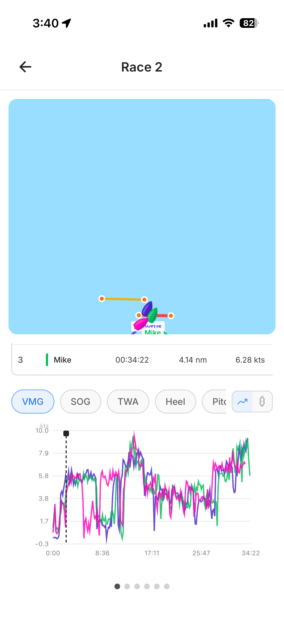
You can also switch to an over-time view that shows VMG or speed as a line chart across the race. Touch the graph to scrub through the race — the map stays synchronized, so you can see exactly which tack produced that beautiful VMG peak or where you lost a boatlength after a gybe.
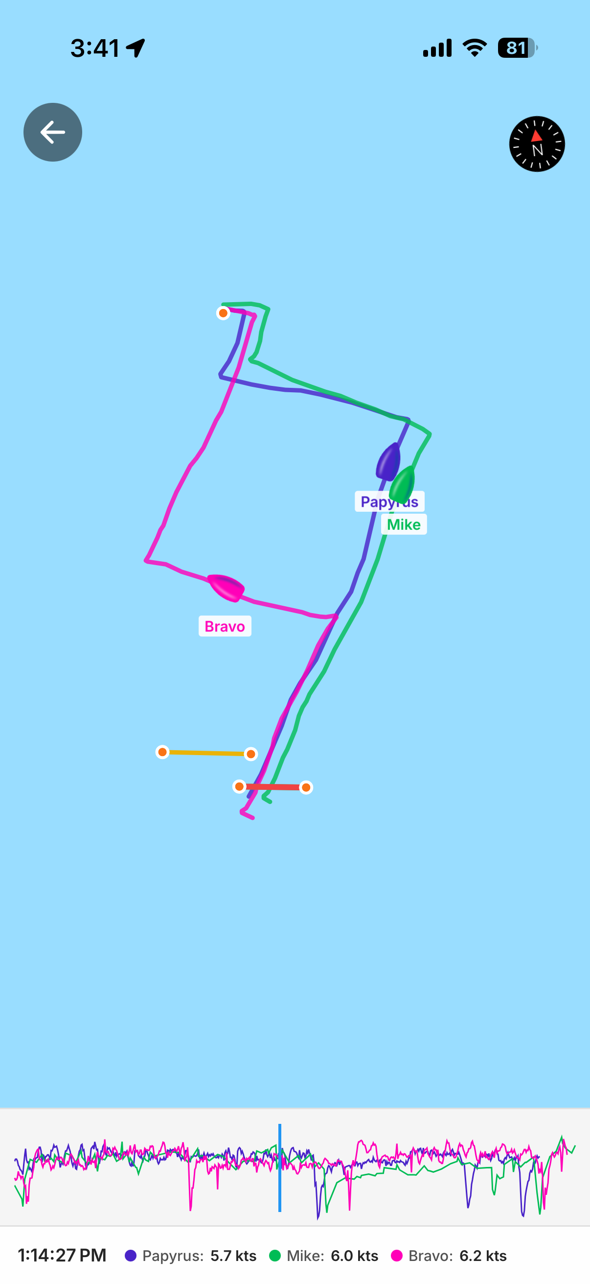
And if you want to go deeper, tap the map to open it full screen. You can zoom into a single leg or a single race and really study the tracks, with the speed graph running along the bottom.
See it in action
Want to see what all of this looks like in the hands of a top sailor? Théo Peyre — French ILCA 7 racer, U21 European bronze medalist, and 2nd at the 2026 French Elite Championship — walked through his own data in a reel on our Instagram. Same features, same depth, but in a quick video format.
Follow @chartedsails on Instagram to see more content like this from sailors who are using the app to get faster.
Get it on your phone
All of this is available right now in the ChartedSails app — free to install, free to import your files. If you've been doing your analysis on the web, try opening your latest session on your phone. You might be surprised how much faster it is to flip through the data when you're sitting on the dock right after racing.
Download ChartedSails and look at your own data today.
Questions? Drop me a line at thomas@chartedsails.com or book a quick call — happy to walk you through it.