Your sailing day, summarized
This week, let me take a few minutes to walk you through the different Sailing Report formats available in ChartedSails, and how to make the most of them.
Sailing Reports were introduced this year and give you all the data points in one easy-to-digest format. The way I like to think about it: ChartedSails used to be excellent at interactively exploring your data — navigating back throughout the day and looking at your speed and angles at specific points in time. Now it's also excellent at giving you a summary of the day (okay, I might be biased!).
You'll find Sailing Reports on the web, in the mobile app, and as a downloadable PDF. Let's walk through them.
Before you open a report — annotate your session
First of all, and this has not changed: to make the most of your data, you do need to spend a few minutes to annotate the interesting moments. I've covered this extensively in past posts and in our Sailing Data Course, but in a nutshell — you want to highlight the races and set the marks.
And by the way — did you notice that ChartedSails automatically detects the wind direction based on your tacks and gybes? That's one less step! Part of our commitment to make sailing debriefs easier.
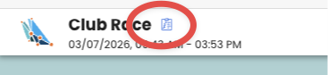
On the web
Once your session is annotated, you can access the report with the Sailing Report icon inside a session:
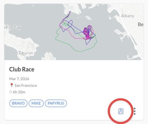
And also from the dashboard:
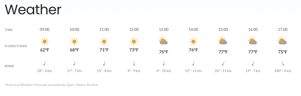
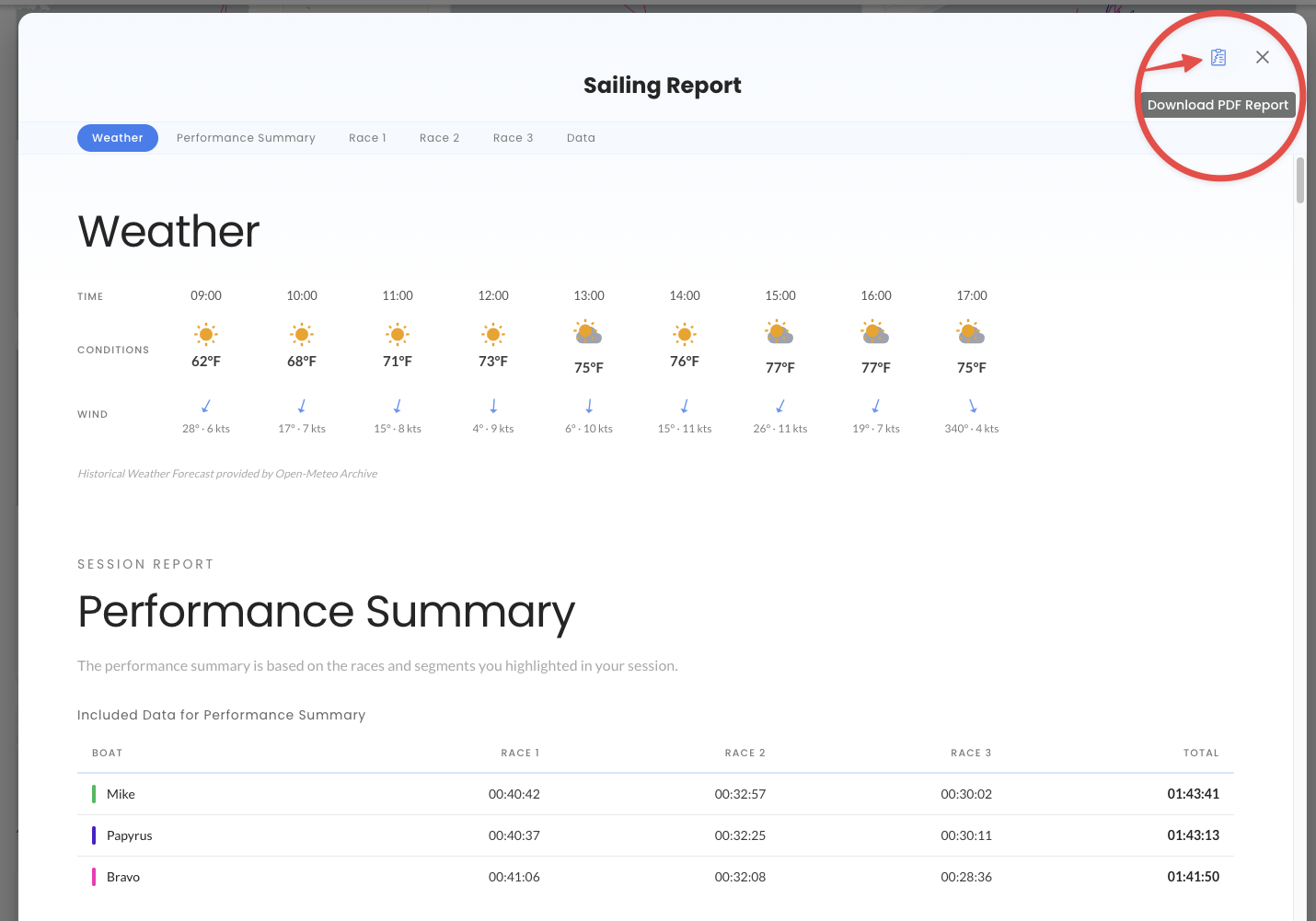
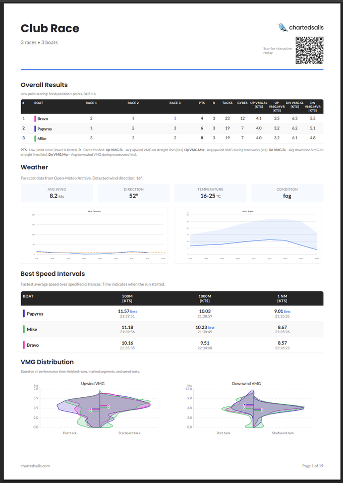
The report starts with an overview of the weather, based on the latest forecast available for your location:
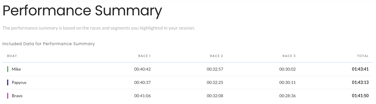
It continues with an overview of the performance of each boat. This overview is computed on only the races that each boat completed. That matters: it means the comparison of upwind and downwind performance is meaningful and ignores all the moments when you were not sailing hard.
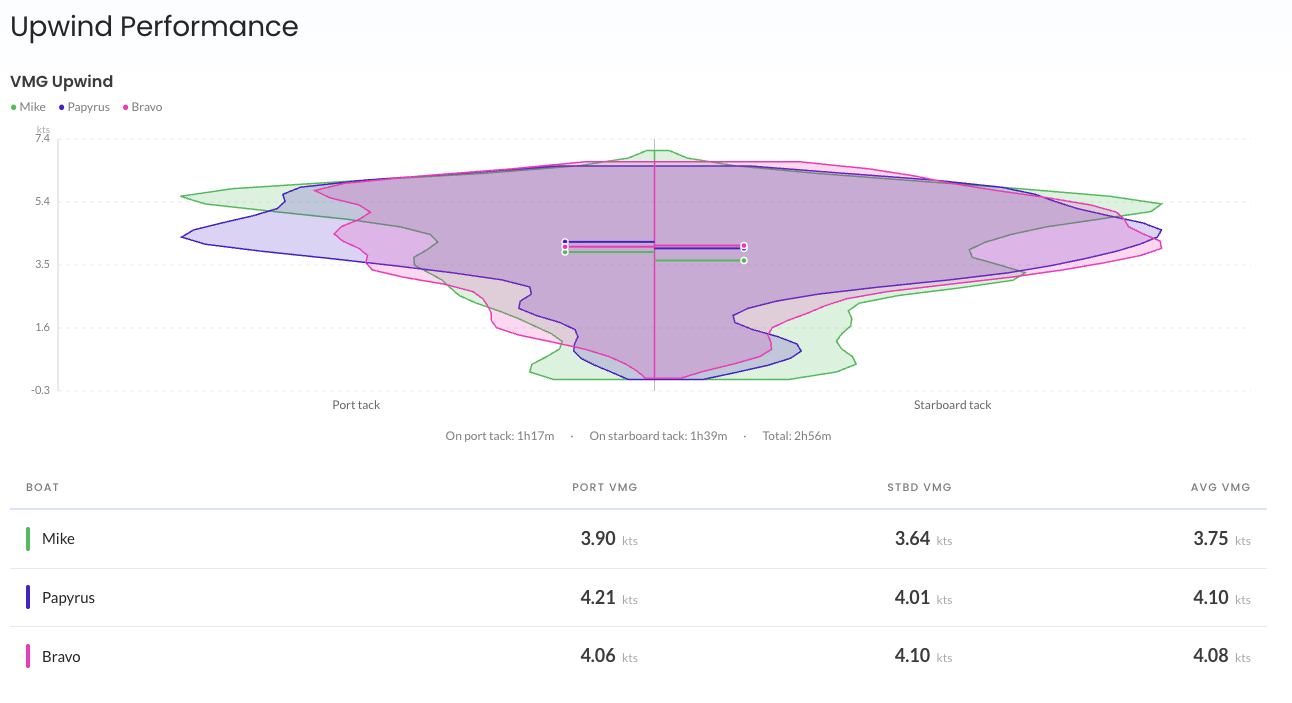
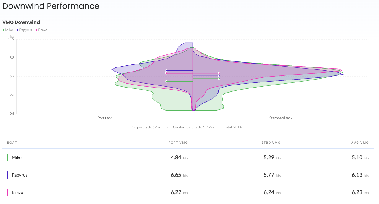
This report remains highly interactive, and you can use the selector at the top to adjust which boats, races, and tests are included:

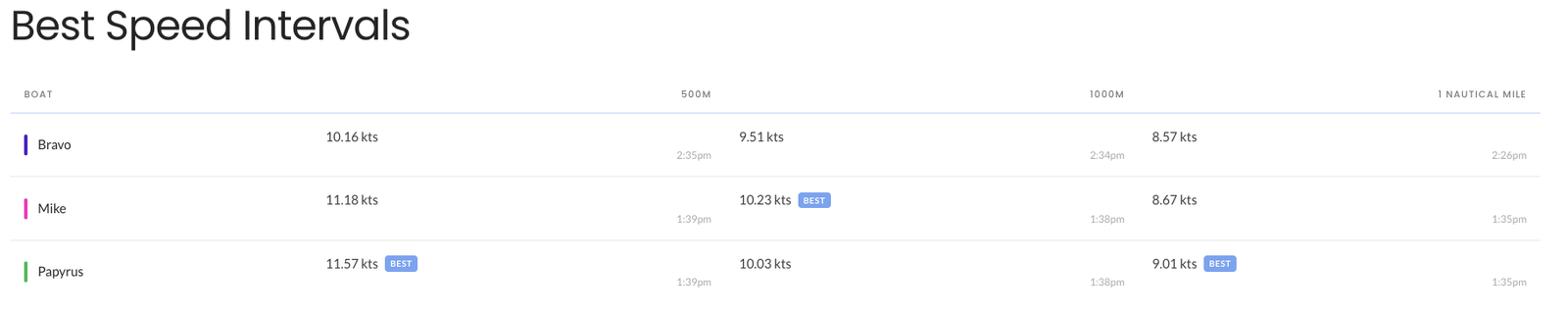
Best Speed Intervals gives you fastest time over a set of distances — great for bragging rights:
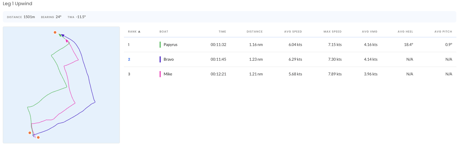
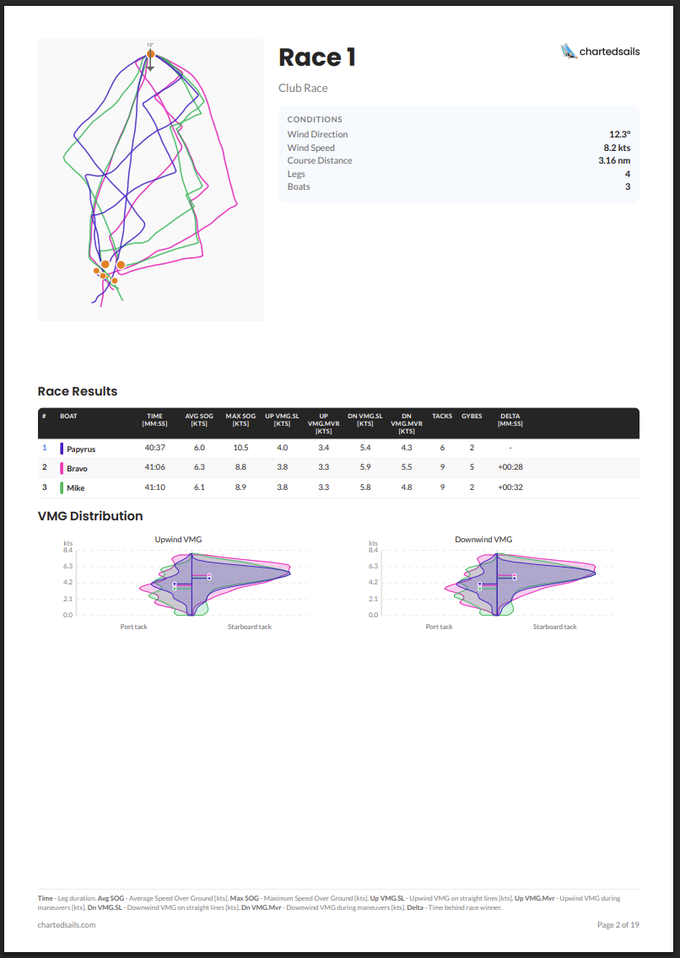
And then each race is broken down with an animation of the entire race, a start analysis, and leg-by-leg analysis:
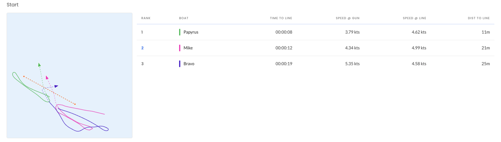
In the start analysis you'll see Time to Line, SOG @ Gun, SOG @ Line, Dist to Line, DMG30 (distance made good toward the next mark in the first 30 seconds) and VMG30 (VMG in that same window). This is the table that tells you whether you actually won your start — or just got away cleanly and slowed down.
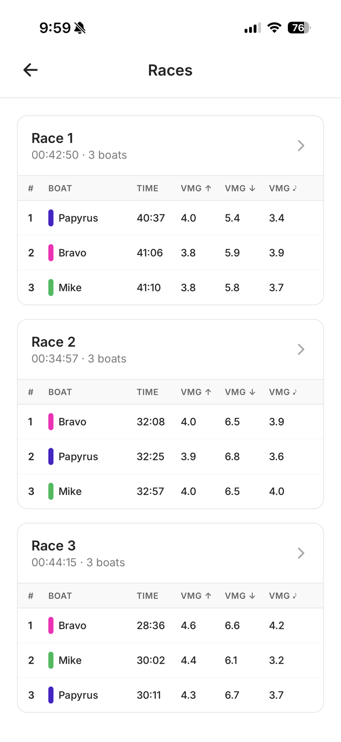
On mobile
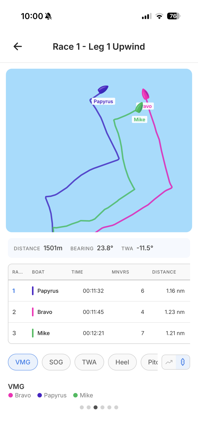
You'll find exactly the same information on mobile. The performance view lets you look at the entire day, or zoom onto a specific race or leg:
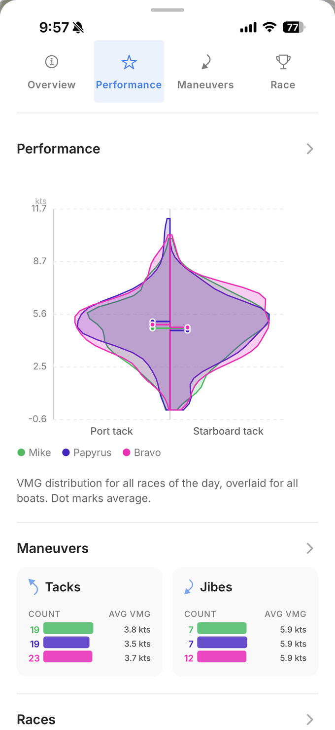
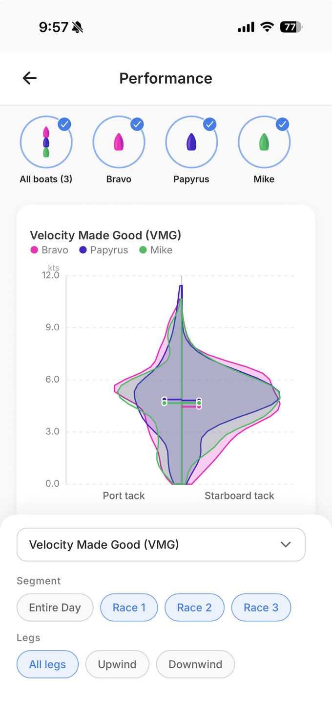
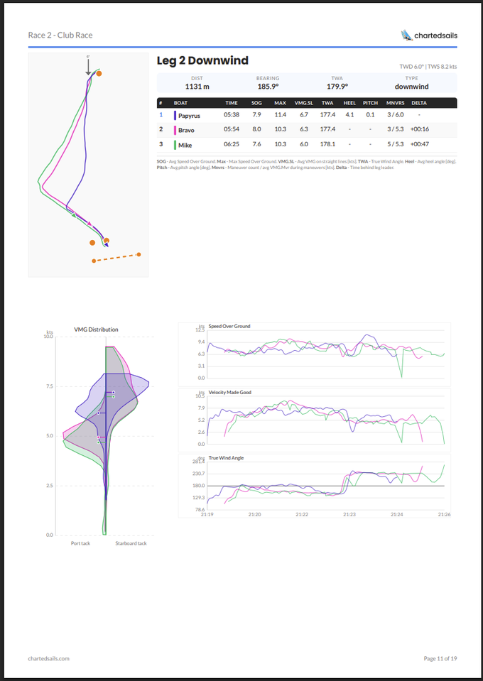
And the Race section includes similar data, grouped by race, with map animations, data tables, and the ability to zoom on specific variables — VMG, TWA, Heel, Pitch, and more:
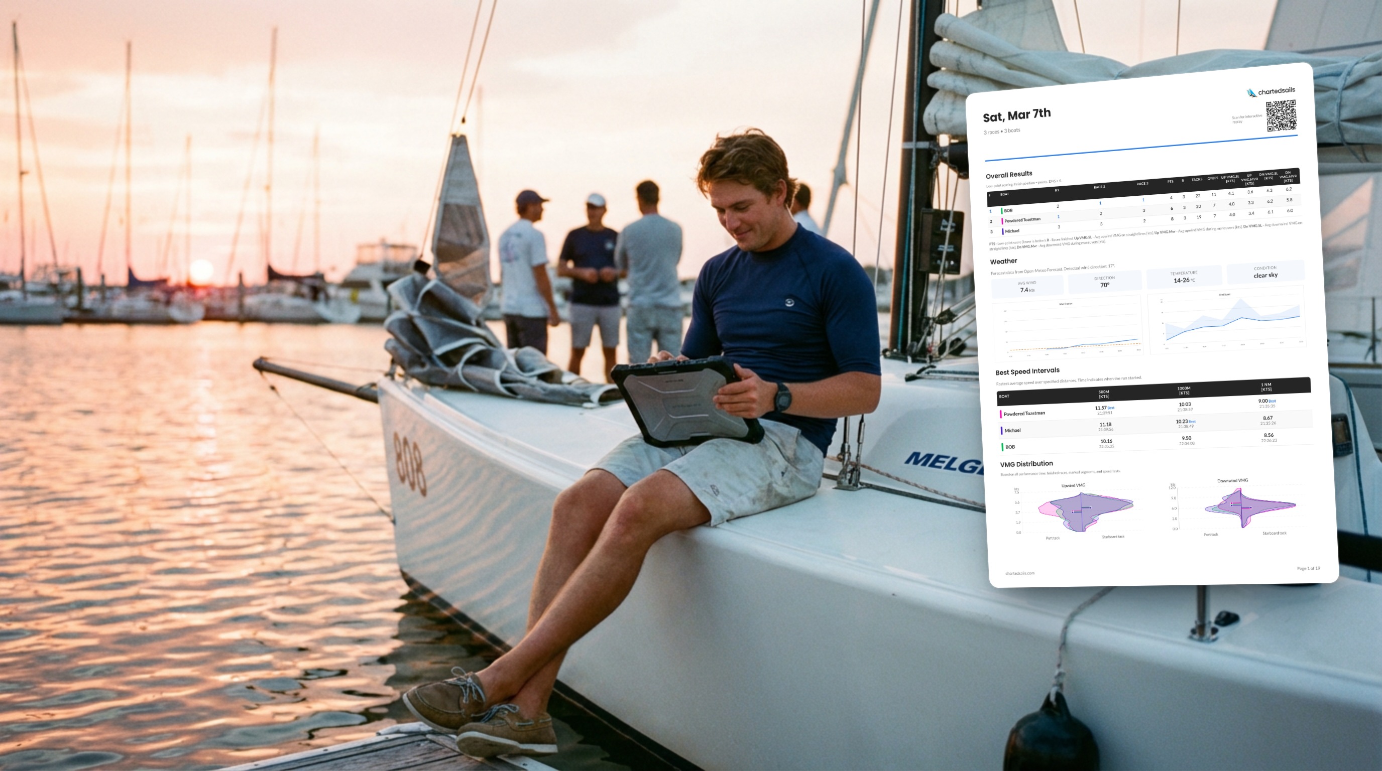
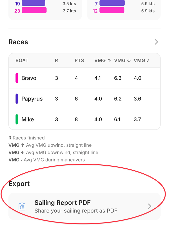
The PDF export
On both web and mobile, you can also download a PDF report:
The PDF contains the same information, but instead of clicking to drill into a specific leg or variable, it lays out the most useful information leg by leg for the whole day. Mini-maps, graphs of SOG, VMG, and TWA over time, and distributions of those variables so you can see where you're spending most of your time and how it compares to the other boats.
It's easy to share via WhatsApp, email, or in a class group chat:
A thank-you, and a small bonus
These reports are a new way to explore your data. They're directly based on the amazing feedback we've received from you this winter, and I want to extend a special thanks to all the beta testers who sent critique and suggestions over the past few months — you can feel your fingerprints on every section.
Now that everyone has access, please let me know what else you'd like to see.
Thanks everyone — and we wish you great data-driven progress this season!
thomas